
Three things worth a look
Nothing big to announce this time — just a handful of smaller improvements to how you organize planbooks, read your plans, and color your week.
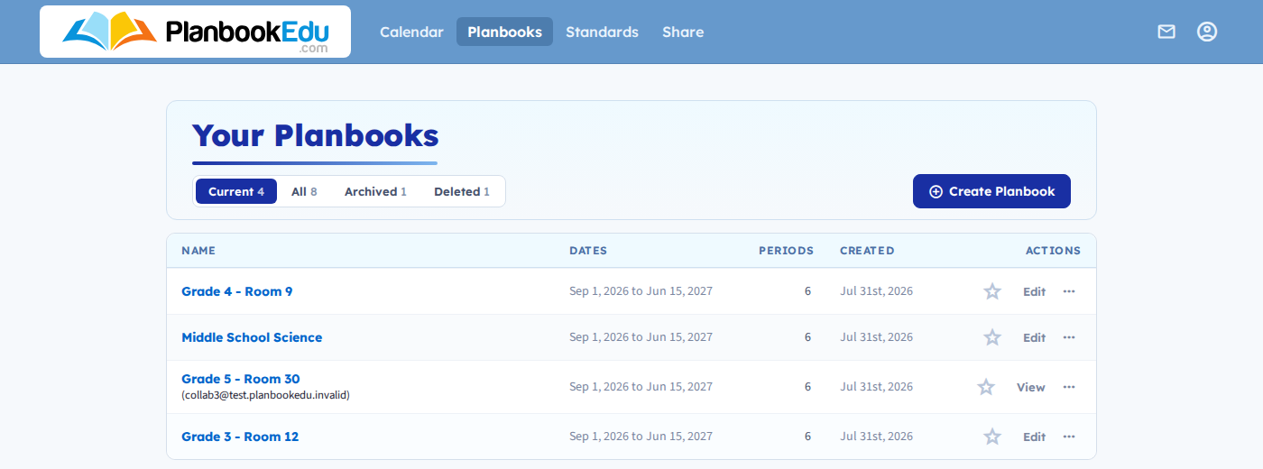
Filter Your Planbooks
The Your Planbooks page now has a set of tabs across the top — Current, All, Archived, and Deleted — so you can jump straight to the group you're after instead of scrolling past planbooks you don't need right now. Only the tabs that apply to your account show up; if you have no archived planbooks, you won't see an Archived tab at all.
Move (or hide) the edit link
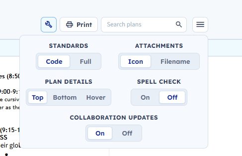
The Edit link on each period used to always sit above your plan text. Now you can choose where it goes — from the options panel (the wrench icon above your planbook grid), under Plan Details:
- Top — the original layout, edit-and-details row above the plan
- Bottom — the same row, moved below the plan text
- Hover — the row is hidden entirely, and appears in the corner of the period only while your mouse is over it
More background colors
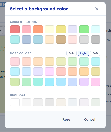
The background color picker on a lesson entry now has more to choose from. Alongside the original 16 colors, a More colors section adds 24 tinted swatches with a Pale / Light / Soft toggle, plus 8 neutral grays for a plainer look.
Questions or feedback?
If something here doesn't work the way you expect, or you just want to tell us what you think, we read every message.